P1: Media & Rep
LO: To develop the language of media analysis
Time publishes a magazine which includes the 100 most influential people. The denotations of this magazine shows a man. The connotations of this is that there is a man from a black ethnic background, showing people that many years on, equality is now as big as ever. The colour pallet is simple, red white and black, which shows that the most influential people are simple. The connotations of the image are that Kanye West is a good listener, and conversationalist, as he is looking directly into the camera (direct address).

Connotations - the arguable elements, relies on person experience


These two album covers have different connotations and denotations. For example, a denotation for 'GOOD KID IN A MAD CITY' is there is a male artist. preferably Kendrick Lamar, in the image. In 'Adele 25' there is a woman. They are both from different ethnic backgrounds.
We can see that there are also differences in connotations also. In 'GOOD KID IN A MAD CITY', the connotations are a rap album, due to the black and white colours, smokey background, and due to the fact that there is a black male on the cover (The rap industry is stereotypically represented by black people). The font also suggests rap, as it is big, bold and has a scratched effect.
 In 'Adele 25', the font connotes to a pop album cover, due to it being so sleek and thin. We can also see that this is a pop album from the connotations of the image, as there is a woman on the cover; in the music industry, women are primarily in the genre of pop.

This Katy Perry album cover is in the pop genre. This is because of the colours that stand out, for example the pink. As of this, the target audience would be young females. The artist is represented as very feminine because of the colours used, and also the font (as it is very curvy and has hearts).
This is the poster for the first James Bond film released in the 60s. The target audience of this film would be 17-35 year old men. This is because the film is under the genre of action, suggested by the smoking gun, representing conflict. Men typically like action movies because they are watching something they would never be able to do, they are watching their fantasies. This poster will also appeal to the target audience, as it has women in revealing clothing. This will appeal to the men of the 60s, as women were primarily seen as sex objects, and to the men that's all they were. As a result of this, they are going to want to watch the film, as they will get to see these women. Also, with society being mostly all heterosexual in the 60s, there is no need for the mans lower half of his body to be shown, despite this, it could still
 attract most groups, as it is leaving a mystery.
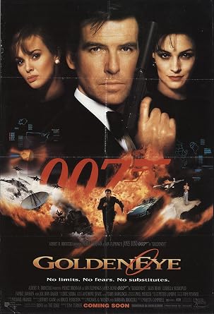
This is another poster for another James Bond movie, Goldenye, released in the 1990s. Like past films, the target audience of this would be 17 - 35 year old men, due to the action related objects in this poster. The planes, cars, guns and explosions suggest action, which will attract men as they typically are brought to it. It will also intrigue heterosexual men, as there are two women on the poster. We can see the development in society, as on the previous poster there are women wearing little clothing, however in this poster, we only see their heads and no longer their full body. This presents Bond no longer as a sexist male to the audience, which could attract a female audience to watch the film. In this poster, the females represent mystery, because of their fade to black; this makes the audience want to watch because they would want to find out who they are and what they are about. Whereas in the first poster, the women are represented as sex objects because they have very little clothing, attracting a primarily male audience.

For this James Bond poster, there has been a much different approach taken. In differences to other posters, there are no women present in this one. This could be because of the change in society, with it being more open about homosexuality, hence why the is the singular man. Despite this, this poster will also attract heterosexual people, as James Bond has connotations of heterosexual relationships within the movies. This poster will also attract the target audience (17-35 year olds) as the gun represents action and combat. The background is primarily black, this could represent the mystery in the film, and making it so the audience have questions, making them want to see it.

Semiotics
L/O: to explore the idea of semiotics and how it can be applied to media analysis

- There is a man in a suit
- There is a woman in a dress
- The is a skull in the background
- The man is holding a gun
Connotations:
- It is a James Bond film because of the '007'
- There is action as he is holding a gun
- The man is of high status as he is in a suit
- There may be a killing, as the skull in the background suggests death
Audience:
- The audience will mostly be straight, 17-35 year old males.
Signifier:
- The man is in a suit
Signified:
- The man in the suit is very formal due to his choice in clothing.
Theory: Ferdinand Saussure
Saussure first put forward the idea that signs are comprised of two elements
Semiotics is the study of signs and symbols and their use or interpretation.
A sign is made up of two elements. The SIGNIFIER and the SIGNIFIED
Signifier - the physical form, the thing that is being considered'
Signified - What our culture has decided this form means'
Theory: Roland Barthes
Barthes theory focuses on how signs and images represent different cultures and ideologies in different ways.
These established through DENOTATION AND CONNOTATION
He argued that some connotations are so widely held that they reach the level of MYTH. A myth in this context is where a socially agreed symbolic association becomes so widely accepted it becomes iconic
For example, a red rose symbolises romance, but in reality it is just a rose.
Theory: Charles Pierce
Pierce focused on developing the idea that there were different levels of meaning that could be attached to signs and that these operated in different ways to audiences.
He claimed there were 3 types of signs:


Icon - physical
index - implies
symbol - conventional relation
To sum up:
We now see semiotics s a system of coding. As a code it can be constructed to create a specific meaning. As a code it can be decoded to understand the elements that lie behind it.

Applying Semiotics
 L/O: to apply semiotic theories when creating media products.
Creating a new fashion label aimed at young adults, I wanted to create something different, yet something i myself would wear. Therefore, I created 'ORBIT', with the main image being a polygonal globe. I feel like young adults would wear this, because most young people are interested in space and planets. It also appeals to an arty audience, due to the planet being polygonal. The design and font has connotations of a futuristic sense and feel. This will attract another audience, those who want to break out of the old and live in the new. The font used may also attract certain people, as it is bold and unique, something people themselves want to be like.

When creating a new TV channel aimed at kids (6-11), I wanted to take a colourful approach. This is because for kids, it will be easy on the eye and having something with a lot of colour will attract children towards it. The eyes on each letter will also attract children, as they are presented as friendly to the audience.

For my app for 20-35 year olds, I wanted to create something obviously aimed at them, therefore I created a stock trading app. This app design will appeal to the target audience, as the green of the arrow has connotations of success.
Conventions
L/O: To apply semiotic theories when analysing media texts

This advert is for a beer. It uses conventional ideas of beer marketing by using the colour of green. This particular colour has connotations of freshness and nature, showing that it is natural and will give whoever is drinking it a refreshed feeling. It would be aimed at males aged 20+ , as people this age would have typically seen Lord of The Rings and would have grown up with it, also the legal drinking age is 18+. Some assumptions that are being made about the audience is that they have watched Lord of The Rings and are over the age of 18 to drink.
Tuesday 26th November
L/O: to explore the concept of conventions and subversion

Denotations:
- beer bottles
- very green
- it says 'bachelor party'
- The colour green has connotations of refreshment
- The colour green also has connotations of natural, showing the beer uses natural ingredients
- The beer itself has connotations of a primarily male target audience aimed at adults.
- The beer bottles on the outside have connotations of the men, whereas the singular bottle in the middle is representing a female, this is backed up by 'bachelor party'.
Conventions:
- Green colour pallet
- Story to it creates humour
Cadburys Gorilla Advert

The advert tells us that Cadbury enjoyable. This is represented through the gorilla who has clearly had some of their product. The gorilla represents the feeling that having one of their products will give you.
The intention of the advert was to break so far out of the norm that it got people talking about it, which it did. This is why it done so well, because it hit their objective. The fact that it is so different to other typical chocolate advert shows this.
The target audience of the advert would most likely be 25-35 year olds. This is because of the song 'In the Air Tonight' by Phil Collins playing. This age range grew up listening this song, so it would attract them to buy the brands product.
I read the advert as there is a gorilla that is being used to represent a person who has just had some of Cadbury's product, chocolate. This makes him feel good and at his best, therefore he plays the drums amazingly.
The impact of this advert on me was great. It makes me want to go out and buy some sweet Cadbury's chocolate. I want to experience what that gorilla is experiencing.
I think that it boosted the brands sales by 10% simply because it is just so far out of the norm that it got people talking about it. By getting people to talk about it, it reminds them just how good the chocolate is.
Benetton

The subversion of the image is that it is going against typical clothing conventions. Clothing adverts when this specific advert was released (2000) would typically be simply models just wearing the companies clothes. However the photographer for Benetton wanted to go against these common conventions, as it would get people talking about it. The photographer would do this by getting/taking images of controversial subjects at the time, such as this image. This photo is of a family with a dying AIDS patient. At this time when this advert was released, AIDS had become the number one killer in the US, a very controversial subject when this was happening.
As for conventions, there is not really any typical clothing conventions in this advert. This is because it is so out of the box and out of the ordinary. It is safe to say that the marketing strategy that the photographer had worked, as it did get people talking about it.
Tuesday 3rd December
L/O: To explore set advertising texts and research brands
How has the representation of the brand 'Barbie' changed since the 1990s?
In the 1990's advert, the target audience was female children. The way the advert would attract them to buy their product would be for the children to beg their parents for it after seeing the two girls happily playing with the doll with smiles on their faces. However, in the 2015 advert, the advertising has changed in some areas, with the target audience also being slightly aimed at the parents. This is because the brand are saying, 'if your child plays with our doll, it will let their mind go explore different futures'. For example, the parents will see the children in the advert teaching a university class, being a vet, etc. This attracts them in.
The representation of barbie in the 1990's was that they sold feminine products for females. However in modern day, the brand is now seen as a brand that tries to influence their target audience into being something great and going somewhere far in their lives, rather than just being influenced into being like a barbie doll.
Research and Context
 Overview of Old Spice:
Old spice before 2011 was a male grooming/aftershave product typically for old men. Firstly introduced in 1937, it was a brand that was originally made for females, however this soon changed to being for men.
Brand Image and Values:
Their brand image and values before 2011 were quite serious. For example, in the 1970 Old Spice advert, the brand taken their advertising in a serious manner, however, after 2010, their adverts became more humorous and exciting.
Previous Advertising Campaign:
Previous Old Spice campaigns included young, athletic people such as surfers who in the advert attract women. This is the typical conventions for aftershave/grooming products at the time, as it got men to buy the product as they think 'women will like me if I use this'.
Star Vehicle:
The main star of the 2011 Old Spice campaign is Isaiah Amir Mustafa, an american actor and former American football player. This was a mega move from Old Spice, as it would attract fans of Mustafa, who are of all ages (young and old). His fans would see him wearing it, and want to be like him, so they wear it themselves.
Advertising Campaign Context:
For this advertising campaign, the company wanted to reach out to a younger audience. At this time, there were riots in the UK.

The company Lucozade is an energy/sports drink that 'enhances performance'. It is manufactured by Suntory, the Japanese company. It was first named 'Glucozade'
Brand Image and Values:
Lucozade's brand image and values before 2013 was that the drink was just an energy drink that most people drank when they was ill. The company's advertising slogan was 'Lucozade aids recovery'. At the time of this Lucozade advert in 2013, the brand wanted to reshape to a sports drink, instead of an energy drink.
Previous Advertising Campaign:
Previous advertising campaigns include the 2012 'Faster, Stronger for Longer' campaign released at the same time as the London 2012 olympics. The advert from the 1990s portrayed the drink as an energy drink.
Star Vehicle:
The main stars of this Lucozade campaign were Gareth Bale and Alex Oxlade-Chamberlain. This appealed to sports fans, as if they see some of the best players in sport drinking lucozade, they will then go out and buy one.
Advertising Campaign Context:
The campaign contained several TV adverts and the posters of the sports stars. The adverts were banned as other company's complained about how Lucozade were claiming it was better than water.

Shelter is an organisation that helps people who are in need just before they are about to go homeless. They campaign that one day, nobody will have to go to them for help.
Brand Image and Values:
Shelter believes that everyone should have a fair say and that everyone should be supported and given advice if needed in certain situations.
Previous Advertising Campaign:
Previous Shelter campaigns include the, some would say, 'sympathetic' campaigns where they would try and make the audience feel sorry for the people. This would get them thinking about it and thinking about people who are much worse off than they themselves are, so it did work.
Star Vehicle:
There is no major celebrities like the past two advertising campaigns, instead they use models to represent home owners.
Advertising Campaign Context:
Each advert depicts an ordinary person in distress because they are facing a serious crisis, such as sudden job loss or mounting debt. They carry a headline which shares the desperation the person is feeling. The aim is for the combined impact of the headline and image to tap in the concerns of the people experiencing these problems, driving them to seek advice on Shelter's website
Tuesday 10th December
L/O: To apply context and representation to old spice advert
Old Spice Social Context:
The magazine advert released in 2011 was a follow up to the 'Smell like a Man, Man' campaign. Mustafa (the main image of the brand) was a famous NFL player who helped the brand win numerous awards for the advertisements and also helped double sales. Their adverts were very popular among social media, getting a lot of views on youtube. Mustafa's first advert in the follow up campaign was an advert during the ad breaks in the super bowl, which also helped get sales, as males would recognise the NFL player and be inspired by him. They were building on the success of the initial 'Smells like a Man' campaign. For the follow up campaign, they were inspired by the smells of the freshest places on the planet, with places like Fiji and Cyprus being the main places for the new adverts.
The adverts that were printed were continued in the 2011 campaign, however with Mustafa's more playful outtake on the Old Spice adverts.
2011 Advert Semiotic Analysis
Denotations:

- There is a muscular man
- The man is holding the product
- It is very tropical on the man
- Direct address
Connotations:
- The man is Isaiah Mustafa, a famous NFL player - men will see him and want to buy the product as they will want to be like him.
- He is holding the product to sell it, if people see that he is using it, they will want to buy it.
- The tropics represent what he smells like, people will want to buy it after seeing this, as they will want to smell and feel tropical
- Direct address shows confidence
- Playful use of the conventional idea of masculinity
How does the product use and subvert the conventional genre stereotypes of masculinity associated with the adverts for such products and brands?
The 2011 Old Spice 'Smell like a Man' campaign uses conventional genre stereotypes of masculinity associated with grooming products and brands by having the main image as a muscular NFL athlete. The conventional stereotypes of grooming products is typically having a hench, buff man as the main star. This shows that whilst Old Spice might have aims of having a comical advert, they still used conventional, typical male grooming advertisements.
In terms of subverting conventions, Old Spice use the design of what is on the model to create a comical outtake, rather than keeping it serious like most male grooming products. They have done this, because it will get people talking about it, which will get more public view and then more sales. They have created this comical, funny side to the advert by adding certain things to the advert, such as the volcano erupting for hair, the man fishing a shark, the man being taken by crabs. All of these things will produce humour for the audience, and has they look into it more, they will find more and more things that will make them laugh.
Also, in terms of subverting conventions, Isaiah Mustafa has not given a very serious presentation in the advertising campaign. In all of the posters, his facial expression is not very sincere. He is giving off a smirk in the posters, often with one eyebrow raised. This promotes a comical mood, whereas in other grooming posters, the facial expressions will usually be very serious; often with no smile or no raised eyebrows, unlike the Old Spice 'Smell like a Man' 2011 campaign.
Tuesday 17th December
L/O: To apply context and representation to the Lucozade and Shelter advert
Lucozade Social Context:
When it first came out, it was often branded as a medicine. It was sold in pharmacies because they bought it (the sugar content would give the ill energy). Its sales fell. They wanted to reshape to an energy drink that will make you feel healthier and better when feeling dull, not just ill. In the 80s they repositioned. Their initial slogan 'aids recovery' changed to 'replaces lost energy'. It was then targeted at young adults who needed a boost of energy. Gradually over time, they just repositioned themselves in the market with a change of target audience and change of slogan, diversifying their brand. In the 90s, they launched lucozade sport. They promised to get to your thirst fast. They were the first brand to launch a sports sponsorship deal (with British Athletics and the FA Carling premiership). In 2003 hydro active was launched; this is a fitness water for people who exercise or go the gym. This carries on the tradition of Lucozade Sport. In 1998, they used Lara Croft from the 'Tomb Raider Video Game'. She performed in some adverts. This helped sustain sales, whilst also boosting them by targeting a younger audience. Now teenagers and younger adults who need the endorsement of a popular icon. By 2013, lucozade sport had established itself as the leading sports drink in the UK. Lucozade is no longr a drink that aids in your reoverywhen you are unwell. It is now a product that scientifically allows athletes to hydrate and perform "Faster stronger for longer." Words such as electorlytes and isotonic capture this sense of scientific legitimacy. The strayed away from the neon colours, which gave the brand an unnatural sense. They now look more artificial.This first advert for lucozade sport was banned for the 'Better than water' caption. They had to take this advert down, as they had no scientific evidence to back this up. It has strong, direct address presenting the advert itself at you, emphasising the facts. This is similar to the second advert they done, so this is a common theme. They have changed the 'Better than water' to 'In a different league', showing that if you drink lucozade like Bale, you will be in a different league. The #IBELEIVE campagin suggests that Gareth Bale believes in the isotonic sports drink. Sports drink found that their competition was water. The celebrity endorsement makes the audience believe in the brand even more. The campaign used more than 1 star vehicles. They used a range of ethnicities, a white welsh Bale, a mixed race Chamberlain and a white Alexa Matthews. They were also influenced by social media for this campaign by using the hashtag.

How does the product use conventional stereotypes associated with adverts for such products and brands? (10 marks)
The brand lucozade uses conventional stereotypes in different ways. One of those ways being the use of star vehicles that are athletes. Typical sports and energy drink brands will use footballers, rugby players, etc. Most energy drink brands, like monster or redbull, would use hardcore sport athletes such as wing gliders, however Lucozade uses footballers like Gareth Bale. This could be seen as a way of saying to the audience 'our drinks are safer than those other energy drinks'. Most sport drink and energy drink brands would use a star vehicle. This is because fans of the celebrity will want to buy the product they're advertising and follow in their footsteps. This follows conventions.
A way Lucozade subvert conventions is in the slogan, #IBELIEVE. They use a hashtag in the slogan. Nowadays, the hashtag is a symbol you might see in everyday life. It is commonly used now on social media, however in 2013 it was still out of the norm. Lucozade were adapting to new branding ways of trying to get a younger audience.
Shelter Social Context:
Traditionally, charity campaigns have lower production value as they would rather spend the money on getting their objective done than spending the money on adverts. These adverts generally create an emotion of guilt and sympathy. Charities do not tend to do adverts very often, as they lose impact by keeping on the theme of guilt. We become desensitised to it.
Shelter launched the 'We can Help' campaign in 2011, with the target audience being primarily people that were in need. Their secondary target audience were the general public, for donations. The campaign was produced on a no cost basis. They had 3 posters showing an extreme close up of different people with each facing different problems. They released the campaign and then tracked the traffic to their website to see if it was raised. They measured the effect of it. In 2013, there was a debt crisis and housing crisis, which was on of the main driving forces for Shelter to act upon. They used conventions to shock the audience, whilst also standing out from the audience. They were launched in four areas which were notified as hotspots for housing problems. The adverts were designed to be on billboards and places that are similar, to stand out and carry its emotional tone. The expressions and the close ups, the eye contact needed to stand out, creating that emotional tone.
Friday 20th December
Explain how representations in advertising are chosen to help sell the product or brand. Refer to two of the adverts you have studied [10 marks]
Brands use various representations to sell their products. For example, Lucozade uses a star vehicle (Gareth Bale) to represent their brand as a sports drink. Gareth Bale is a popular football player, and with him being on the front of their advertisements, their product is then represented as a drink for athletes and people who do sport that want to enhance their ability. This is similar to the Old Spice advert. They also use a star vehicle to represent their brand and products as manly. The star vehicle they use is Isaiah Mustafa, as famous NFL player who is very big and muscular. Brands have chosen these star vehicles to represent their brand as they help sell their products and boost sales by appealing more to their target audience. The representations have been created through these star vehicles. Using these people, the brands are represented as a young peoples brand. They have used athletic stars that bring in a younger audience who look up to these famous athletes. The Old Spice advert is also primarily target at women, which subverts conventions. This is shown through the star vehicle of the advertisement. The physique of Mustafa will attract women, and then they would wish their significant other would be like him, and also smell like him.
Self Assessment
WWW - Explanation of linking the representations
EBI - Use more media terminology


JB ANALYSIS DIRT:
ReplyDeleteBetter but you just corrected one section
LOGO DESIGN:
I like the designs but you need to consider your explanations of your design choices more carefully. Your first design is great but has no relation to a clothing brand?? (You need to think about the connotations of the elements and link those to your brand). Your second design is the best so far but you need to talk about the connotations and signified meanings of the different elements. Third design needs a detailed explanation.
CADBURY'S ANALYSIS:
ReplyDeleteWell done - a solid analysis
BENETTON ANALYSIS:
This is unfinished - please complete.
SET TEXT NOTES & ANALYSIS:
ReplyDeleteYou've got some good notes but make sure you can fully explain the different stereotypes used. E.g. The traditional stereotype of masculinity which includes...
The Old Spice analysis is good: detailed and with solid evidence to support your ideas. Your analysis of the Lucozade advert is weaker - they weren't new in using a hashtag at that point, but it reflects the changing social context and the growing importance of online marketing and social media
ADVERT EXAM PRACTICE - a good first go! Make sure you explain specifically what the brand images of both products are.
ReplyDelete